 News
News 
Introducing the 2022 Sherwin-Williams Color of the Year
 Subscribe to FREE newsletter
| Oct 02, 2021 |
See what paint colors, wood tones, metal finishes and other materials coordinate best with the 2022 Color of the Year.
Director of Color Marketing Sue Wadden and her fellow color experts at Sherwin-Williams knew green was going to be an important color for 2022. But they wanted to pick the perfect green for the Sherwin-Williams Color of the Year. “We didn’t want it to be too dark or something you’d necessarily relegate to a cabinet or a piece of furniture or an accent wall,” she says. “We wanted it to be a color you could put on all four walls — and have it look really beautiful.”
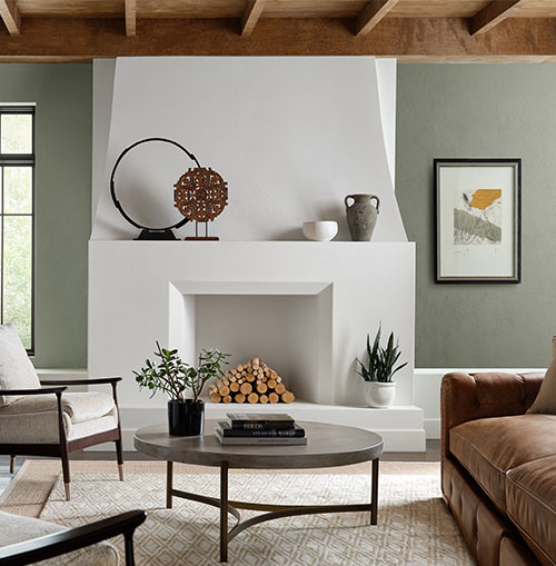
Evergreen Fog SW 9130 (215-C4) stood out as the winning hue. “It’s not in your face,” Wadden says. “It’s a little more subtle, a little more recessive and a little more relatable.” And although Evergreen Fog’s neutral undertone makes it adaptable, the color is at its best when paired with the right colors, finishes and materials. Here are Wadden’s recommendations.
Coordinating Colors
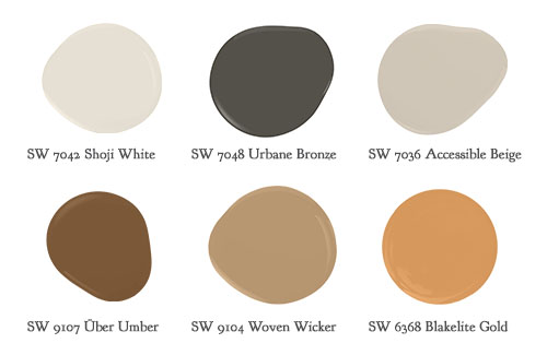
Pair Evergreen Fog with Shoji White SW 7042 (245-C4), Urbane Bronze SW 7048 (245-C7), Accessible Beige SW 7036 (249-C1), Über Umber SW 9107 (203-C7), Woven Wicker SW 9104 (203-C4) and Bakelite Gold SW 6368 (128-C4). All colors are from the Method palette of the Sherwin-Williams Colormix® Forecast 2022.

Coordinating colors extend the natural appeal of Evergreen Fog SW 9130 (215-C4) — with a comfortable touch of contrast.
Wood Finishes
Wood surfaces are shifting to simpler, more organic looks, with finishes that are “barely there.” The effect magnifies nature’s imperfections and each species’ unique thumbprint, creating a sense of serenity that’s in keeping with Evergreen Fog.

Rough-hewn finishes that celebrate the color and grain of wood pair exquisitely with Evergreen Fog, as well as the coordinating color Shoji White SW 7042 (254-C4).
Tile and Stone
An interest in handcrafted, more tactile quality is inspiring experimental surfaces and glazes for ceramics and raw materials. The result — rougher tile and stone surfaces — combines particularly well with this color.

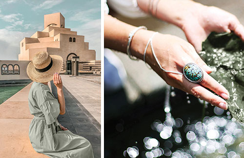
The tactility and soft color of natural stone and handcrafted tile complement the Color of the Year.
Metals
Gold, silver and matte black metals work beautifully with the Color of the Year and its complementary raw wood finishes and rough stone textures. “In general, we’re seeing warmer, more balanced metallics,” Wadden says. “And it can be a mismatch — warm champagne gold, for instance, with tarnished silver and black finishes.”

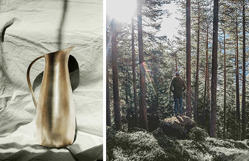
Warmer metals — including the burnished gold finish of a sculptural pitcher — express the raw, elemental beauty of nature and pair beautifully with soft greens such as Evergreen Fog.
Textiles and Other Textures
Tweedy and grainy monochromatic textiles introduce a look that’s soft and tactile. These textiles, along with natural materials and organic shapes, provide the perfect complement.
Learn more about the influences behind the 2022 Color of the Year — including nature, nostalgia and well-being — in this Q&A with Wadden.
@SWDesignPros #SWDesignPros @SWPaintPros #SWPaintPros
For other relevant searches, you might want to try:
