 News
News 
Colorful Journey: Balancing Preservation and Personal Style
 Subscribe to FREE newsletter
| Oct 19, 2020 |
A design duo with a background in historic preservation breathes colorful new life into a house built more than 200 years ago.
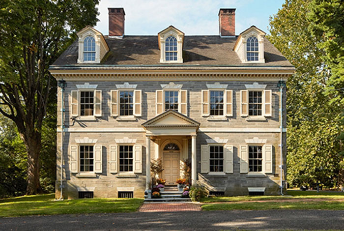
Opportunities to purchase a house with a history as storied as that of Upsala rarely arise. Although the Philadelphia property was not built until 1798, local lore says General George Washington’s army used its site to set up cannons for the Revolutionary War’s Battle of Germantown. Two hundred-plus years later — including 60 years that Upsala served as a house museum — the house went up for sale.
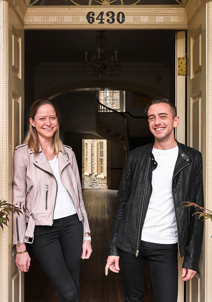
Historic preservationists Violette Levy and Alex Aberle, who’d already renovated homes in Brooklyn and Philadelphia, jumped at the chance to buy. Their offer was accepted by the owner at the time, the National Trust for Historic Preservation, which also owns the historic house Cliveden across the street. “Having experience in the industry and an understanding of what it was going to take to bring the house back to life probably worked in our favor,” Levy says.
Bringing the 10,000-square-foot house back to life began with a thorough cleaning, followed by painting — Emerald® Interior Acrylic Latex Paint for the walls and ProClassic® Interior Acrylic Latex for the trim. STIR connected with the couple to get the inside story.
STIR: Renovating and preserving a house like this is a major undertaking. Why was painting a first priority?
Levy: One of our main goals when we moved in was making the space our own, and paint really allowed us to do that. Just by painting the rooms, we felt like this was our house now, rather than a museum that had actually been neglected for a number of years.

Violette Levy and Alex Aberle began rehabbing historic homes in Brooklyn while Levy was in graduate school for architecture. The couple cemented their focus on preservation after moving to Philadelphia, where they renovated a number of historic rowhouses before purchasing Upsala.
STIR: Still, the house retains much of its original character, right?
Levy: Yes. Each room is full of details from when the house was built — old mantels and windows and woodwork. So there’s a lot of historic character, and we are bringing our personality into it by choosing colors we like and applying them to those historic features.
Aberle: And if anything, I think the color, art and modern furnishings help highlight the historic aspects of the house. In a room full of modern furniture, a 200-plus-year-old mantel is the odd element out. So it’s sort of an indirect way of celebrating the historic qualities of each room.

Levy and Aberle are still deciding what color to paint the exterior trim and shutters, now painted a pale yellow. Historic photos show colors closer to black and white.
STIR: The library, with its beautiful mantel and woodwork, provides a good example of this. How did you choose that color?
Levy: That was the color of the room when we moved in. We had record of a paint analysis being done in the past, and that orange color was the historic color of the room. We wanted to get as close to it as we could, so we used ColorSnap® Match to match the color to Baked Clay SW 6340 (124-C5).
Aberle: The match was so close, we had trouble figuring out where we had painted already and where the original paint was in good condition and remained. We either overlapped or missed some spots, but either way, you can’t tell.
STIR: But you did change the color of the living room, yes?
Levy: In the living room, it’s Mauve Finery SW 6282 (190-C2) above the chair rail and Roycroft Pewter SW 2828 below. It’s a really bright room, so we wanted to keep it that way. And the color ended up working beautifully because we have magnolias that bloom outside the living room windows every spring and the color is almost identical to the flowers.

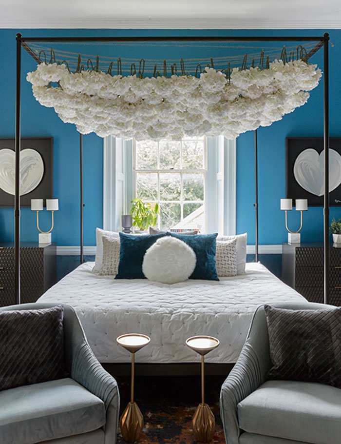
Turkish Tile SW 7610 (280-C6) in the main bedroom sets a jewel-tone scene for all second-level rooms.
STIR: The blue in the main bedroom is stunning. What inspired you to select that color?
Levy: We had this vision for the second floor — to coordinate jewel tones for all of the rooms. We started with Turkish Tile SW 7610 (280-C6) in the bedroom, which turned out to be a pretty good decision because it set the tone for how we were going to do the rest of the floor.
STIR: The preservation continues to be a work in progress, but how do you feel about your color choices so far?
Aberle: Painting these rooms has done so much more than we ever expected. People come in — maybe six months since they’ve last been here — and they’ll say, “You did the whole room and it looks spectacular!” And all we’ve done is paint the room, nothing else. It’s like night and day with just a coat of paint.

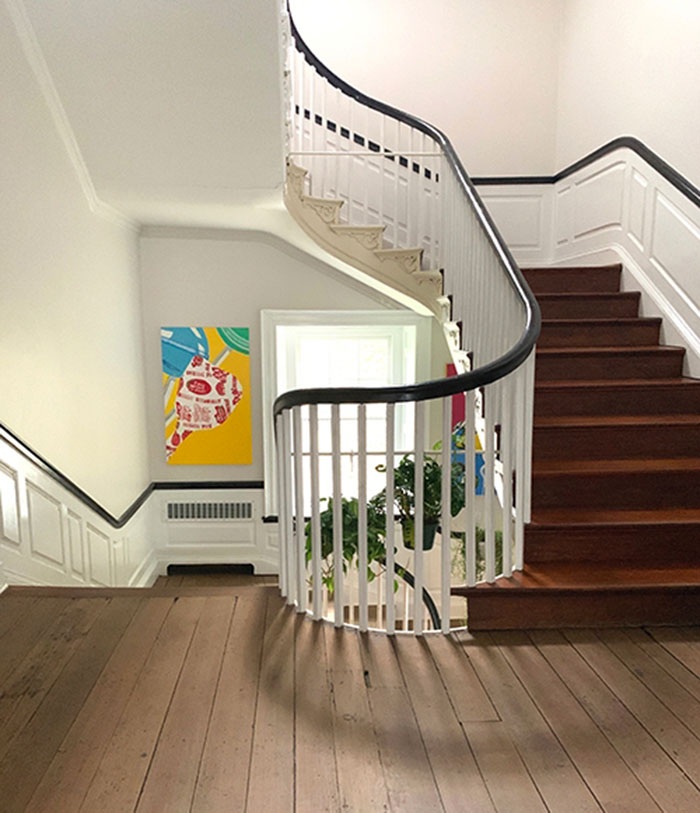
The stairway hall stays bright with a custom version (50 percent pigment) of Crushed Ice SW 7647 (255-C6).
Photos by Samuel Markey and Violette Levy
@SWDesignPros #SWDesignPros #color
For other relevant searches, you might want to try:
