 News
News 
Case Study: Denver Art Museum
 Subscribe to FREE newsletter
| Aug 31, 2022 |
Two custom ceilings helped rejuvenate the time-honored design of an Italian architect while enhancing the art museum experience with modern upgrades.
Renovating and expanding a world-renowned art museum designed by a well-known Italian architect comes with its share of design challenges. But for the Denver Art Museum, an iconic institution of visual art, it was a necessary revitalization effort to better serve the steady increase in foot traffic that has now grown to more than 800,000 annual visitors.
One of the more iconic structures that grew from the museum’s late 20th century expansion is the Martin Building. Formerly known as the North Building, it is a dramatic two-towered, eight-story, castle-like gallery designed by Italian modernist Gio Ponti and completed in 1971. The design was a sharp departure from the temple style often associated with gallery architecture.“If a museum has to protect works of art,” Ponti once famously noted, “isn’t it only right that it should be a castle?”

As part of a larger campus renovation, the museum’s leadership announced plans in 2016 for a significant overhaul of the Martin Building to keep pace with the increasing patronage. The goals were straightforward: modernize the building to meet the demands of today’s museum-goers; align it visually and functionally with its campus neighbors, the Hamilton Building and the Denver Central Library; and preserve the integrity of Ponti’s original creative vision. Transforming those goals into a reality, however, was no small feat.
“Our mantra for the revitalization effort was always, ‘What would Ponti do?’ says Stephanie Randazzo Dwyer, principal at Boston’s Machado Silvetti, who, along with Denver’s Fentress Architects, served as the architectural team behind the renovation. “At Denver Art Museum, Ponti employed unusual and incredibly striking combinations of triangular shapes and curved shapes in everything from the exterior form of the building to a one-of-a-kind stainless steel entrance portal to huge elliptical scoops cut out of the top of the building. Our vision was to hew as close as possible to all of Ponti’s details, while upgrading technical systems, increasing vertical transportation capacity, upgrading the weather envelope, and ensuring accessibility throughout the building.”
All improvements were designed to heighten the gallery’s offerings and enhance the visitor experience. This included the addition of the new Anna and John J. Sie Welcome Center, an elliptical structure with a glass facade housing guest services, two dining options, a special corridor, and a second-level event space that expands the museum’s functional versatility.
While the welcome center enjoys an abundance of natural light, the design also called for the clever use of interior artificial light to add to the visitor experience. One of Ponti’s central themes was light play: “I asked the sun and the light and the sky to help me,” Ponti quipped of his design. More than a million reflective glass tiles cast light patterns across the exterior of the castle’s towers, while the seemingly randomized fenestration mixes various window shapes and sizes into positions that add to the light play inside and strategically protect artwork from the deleterious effects of sunlight.
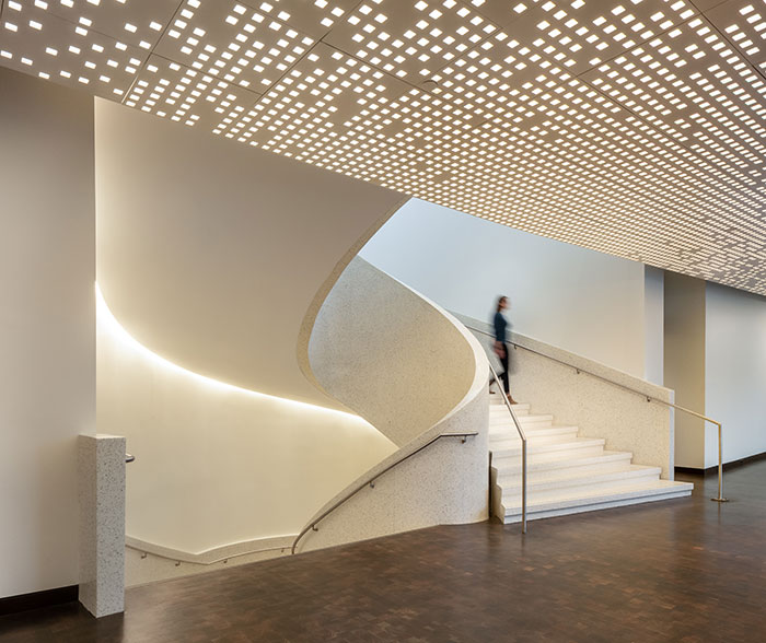
Manipulating the welcome center’s artificial light with the same playfulness required similar innovation and artistry to that which Ponti had employed — plus the right materials to execute it. That’s where two custom-engineered, awe-inspiring ceilings come in.
@CTCeilings #CTCeilings #acoustic #ceilings #design
For other relevant searches, you might want to try:
